Case study
Liight-TechPowerSolutions
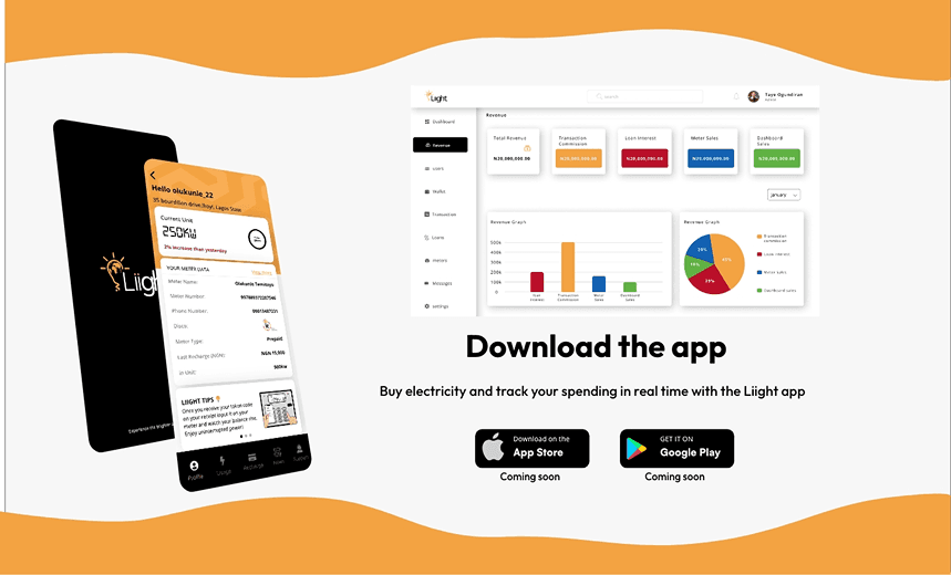

The Liight app gives users a convenient, efficient way to manage and pay for their electricity. It simplifies bill payment, lets people track their energy consumption, and promotes energy efficiency and cost savings.
Product designer across the Liight app, the landing page, the admin dashboard and an intuitive business-to-business dashboard for industries.
Liight faced challenges in user adoption, integration with utility providers, data accuracy and privacy, user experience and interface design, customer support and issue resolution, security and fraud prevention, and regulatory compliance. Overcoming them was critical to the app's success.
Targeted marketing, seamless utility integration, robust data validation, intuitive interface design, comprehensive support, strong security and fraud detection, and close regulatory adherence.
The User Research
Research focused on the preferences, needs and behaviours of the target audience. Users need a registered meter number for credit and an active phone number or email address for KYC authentication and security. I ran a competitive audit of BuyPower, Efactory and other third-party payment platforms.
Surveys gathered quantitative data on demographics, current payment methods and pain points. In-depth interviews then explored people's experiences, challenges and expectations around electricity payment and energy management, and usability testing on early prototypes surfaced issues to fix.
The findings highlighted the importance of user-friendly interfaces, transparent billing, energy consumption insights and convenient payment options, and they guided the design of the Liight app.
The User Pain Points
Inconvenient payment process
Visiting physical offices or making manual bank transfers to pay for electricity is time-consuming and inconvenient.
Lack of payment visibility
Users struggle to track their payment history and details, which hurts transparency and makes budgeting harder.
No energy consumption data
kWh usage and the costs attached to it are hard to understand, so people can't manage or optimise their energy use.
Limited payment options
Without flexible options like mobile payments or online banking, paying on time is less convenient.
User Story Board
The storyboard follows a user's journey through the Liight app, capturing the essential steps and touchpoints to reach their goals. It helps the development team understand the flow and spot where the experience can improve.
Paper Wireframes
I started with paper wireframes: rough sketches of the layout and structure of each screen, used for quick ideation before going digital. They cover onboarding, dashboard home, usage, recharge, news and support.
Storyboard sketches
Main-screen frames
Digital Wireframes
I redesigned the Liight app end to end to improve its functionality, usability and overall experience, and bring it up to modern design standards.
The original version suffered from usability issues, an outdated interface and low engagement. The key challenges were:
- A cluttered interface that confused users.
- Inconsistent design elements across screens.
- A lack of intuitive navigation and user-friendly features.
Approach
To tackle these challenges I took a comprehensive design approach:
- User research interviews and usability tests to find pain points and gather feedback.
- Wireframing and prototyping wireframes and interactive prototypes to visualise the new structure and flow.
- Visual design a fresh visual identity with modern colour, typography and iconography.
New Features
Liight Loan
Lets users borrow electricity units, making power more affordable and accessible.
Power Management Tips
A carousel on the user page with tips and advice that promote energy conservation.
Redesigned Screens (Web App)
Outcome
The redesigned Liight app resulted in:
- Improved user engagement and adoption rates.
- Positive feedback on usability, aesthetics and the new features.
- Increased customer satisfaction and retention.
Conclusion
Redesigning Liight let me apply my design skills to real-world usability challenges and build a more impactful product. New features like Liight Loan and the Power Management Tips carousel made the whole experience better.
Wasteefy